3. Plotly API#
Easy to use
To create a viz, Single line of code, plt.plot(list)
import matplotlib.pyplot as plt
import numpy as np
3.1. Line Chart#
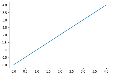
plot() creates line chart by default
Index as x axis
elements as y axis
plt.plot([0,1,2,3,4])
[<matplotlib.lines.Line2D at 0x7fc6c83dae20>]
3.1.1. Important Points#
If we are coding outside of Jupyter, use plt.show()
If you want to supress the text message of viz, add semicolon in the end of plt.plot();
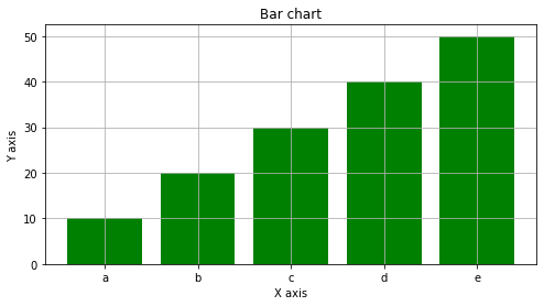
3.2. Bar chart#
Categorical vs Numerical
x=['a','b','c','d','e'] # 5 categorical values
y=[10,20,30,40,50] # 5 numerical values
plt.bar(x,y)
plt.show()

# Charts can be created in two lines of code

3.3. Customizations#
# Size of canvas
plt.figure(figsize=(8,4))

# Color
plt.bar(x,y,color='green') # Giving same color to all the bars
# plt.bar(x,y,color=['blue','black','yellow','green']) # Giving different color to all bars

# Labels
plt.xlabel('X axis')
plt.ylabel('Y axis')

# Title
plt.title('Bar chart')

# Showing grid
plt.grid()

plt.show()
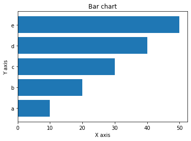
3.3.1. Horizontal bar chart#
plt.barh(x,y)
plt.xlabel('X axis')
plt.ylabel('Y axis')
plt.title('Bar chart')
plt.show()
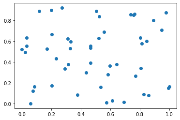
3.4. Scatter Plot#
x=np.random.rand(50)
y=np.random.rand(50)
Numerical data vs Numerical Data
plt.scatter(x,y)
<matplotlib.collections.PathCollection at 0x7fc6eb636730>
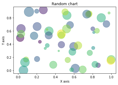
3.5. Customizations of plot#
Changing color,size
colors=np.random.rand(50)
sizes=(np.random.rand(50))*1000 # *1000 to get greater sizes
plt.scatter(x,y,c=colors,s=sizes,alpha=.5) # alpha for intensity

# Labels
plt.xlabel('X axis')
plt.ylabel('Y axis')

# Title
plt.title('Random chart')

# Size
plt.figure(figsize=(8,4))

# Show
plt.show()
<Figure size 576x288 with 0 Axes>
Note: All of this needs to be defined in one cell only otherwise graph won’t show up
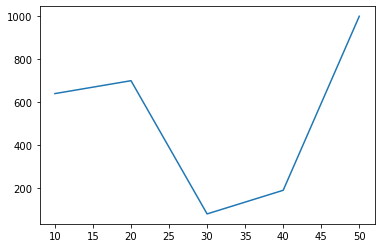
3.6. Plotting in coordinate system#
plot x points against y points
x=[10,20,30,40,50]
y=[640,700,80,190,1000]
plt.plot(x,y)
plt.show()
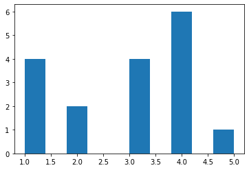
3.7. Histogram#
Intensity of repetations
x=[1,2,3,4,5,4,3,1,1,3,3,2,1,4,4,4,4]
plt.hist(x)
plt.show()