4.5. Bar Chart#
Pro tip: Use groupby() and agg() to aggregate your data and push the labels to axis
import pandas as pd
import matplotlib.pyplot as plt
data = {'Month':['Jan','Feb','March','April'],
        'Sales': [99, 98, 95, 90],
        'Profit': [10,20,30,40]
       }
df=pd.DataFrame(data,columns=['Sales','Profit'],index=data['Month'])
df
| Sales | Profit | |
|---|---|---|
| Jan | 99 | 10 |
| Feb | 98 | 20 |
| March | 95 | 30 |
| April | 90 | 40 |
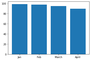
fig,ax=plt.subplots()
ax.bar(df.index,df['Sales'])
<BarContainer object of 4 artists>
4.5.1. Customizations#
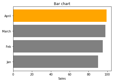
fig,ax=plt.subplots()
ax.barh(df.index,df['Sales'][::-1], # acs/desc
        color=['grey','grey','grey','orange']) # Horizontal bar chart
ax.set_title('Bar chart')
ax.set_xlabel('Sales')
Text(0.5, 0, 'Sales')