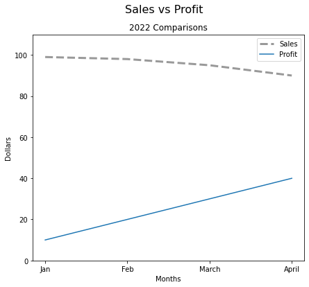
fig,ax=plt.subplots(figsize=(7,6))# default size of canvas is 6.4 x 4.8# Individual Customizationsax.plot(df.index,df['Sales'],#df.index,df['Sales']/ 100000, if you want in millions label='Months',color='grey',linewidth=3,alpha=0.8,ls='--')# linestyleax.plot(df.index,df['Profit'])# Titlesfig.suptitle('Sales vs Profit',fontsize=16)ax.set_title('2022 Comparisons')# Labelsax.set_xlabel('Months',fontsize=10,)ax.set_ylabel('Dollars',fontsize=10)# Legendsax.legend(['Sales','Profit'])# Axis limitsax.set_ylim(0,110);# Note: Always start y axis from 0# ax.legend(df.columns) if lot of lines and you want it automatically