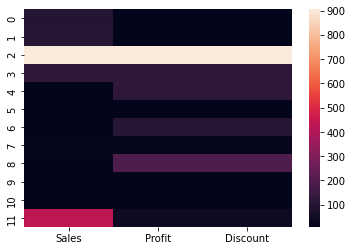
10. Heatmap#
See the most common value
Only be used with Numerical Values
Nulls are plotted as black cells
import seaborn as sns
import pandas as pd
data = {'Sales': [99, 102, 905, 120,12,12,12,22,12,12,12,430],
        'Profit': [9, 12, 905, 120,120,12,102,22,192,12,12,40],
        'Discount': [9, 12, 905, 120,120,12,102,22,192,12,12,40]
       }
df=pd.DataFrame(data)
sns.heatmap(df);
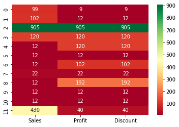
sns.heatmap(
    df,
    annot=True,
    fmt='g', # format the data to apprear correctly
    cmap='RdYlGn' # Get in green and red
);
10.1. Note#
use df.corr() to find corelation of numerical variables
Very useful for data analysis